The Oregon Ducks have seen a lot of change over the past few years, and they’re undoubtedly going to see more in the near future. As of August 2, the University of Oregon will be part of the Big Ten Conference, moving away from the Pac-12, and they’ll be faced with a new horizon where endless possibilities await.
That may be daunting for some to think about, but when you consider what Oregon is at its core — innovative — then the change should feel like second nature.
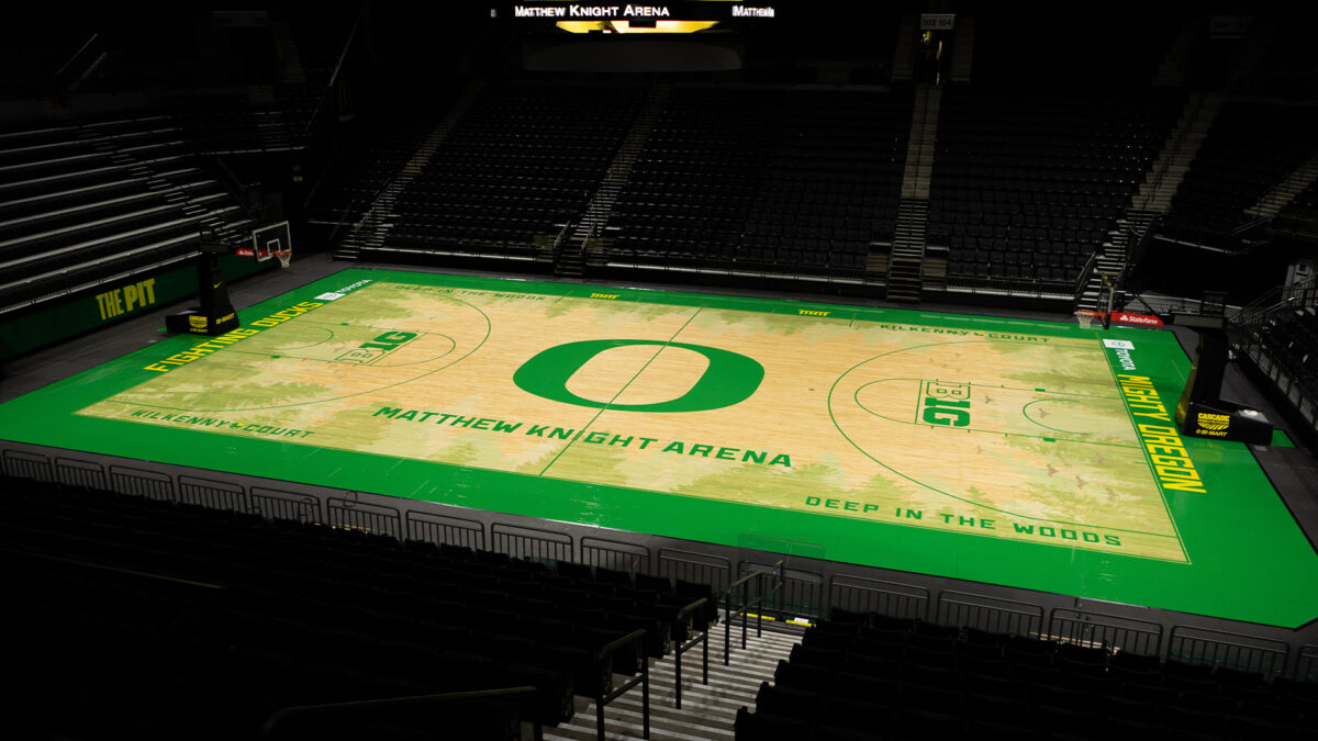
With the massive changing of conferences, the Ducks took it upon themselves to make a change of their own this summer, undergoing a makeover of the basketball court at Matthew Knight Arena. The University unveiled the new court design on Sunday afternoon to much adoration from the fanbase.
Out is the brownish tint of the evergreen trees in MKA’s old “Deep in the Woods” design that was unveiled in 2011, and in is a new, vibrant green and yellow masterpiece that is innovative and fresh.

While the design is new, at the core of it is history.
History of the Tall Firs, and McArthur Court. History of the original court that was designed by the legendary Tinker Hatfield when Matthew Knight Arena opened earlier this century.
History, but better.
“We got into looking at some of the things that came across really well and the relationship the trees had the first time around,” said Todd Van Horne, the Founder of Van Horne Designs and Creative Director of the project. “We thought of how to do those things differently, and how to do them better.”
In the grand scheme of things, the design of the new court is similar to that of the old; tall fir trees surround the edges, jutting into the middle of the court and giving a viewpoint of looking up to the sky while sitting in an Oregon meadow.
It’s not a complex idea, but the reasoning behind it is meaningful.
“The original intent back in the day with Tinker Hatfield and myself was this conversation about Matthew Knight,” Van Horne said, speaking of Nike co-founder Phil Knight’s eldest son, who passed away in a scuba-diving accident at age 34 back in 2004.
“He’s looking down at Eugene from the heavens and us here on Earth looking up to the heavens. You’re sitting in this meadow, and you’re seeing these trees around you and this environment that makes Eugene and Oregon such a special place.”

Matthew Knight — whom the arena is named after — is also represented in some of the finite details of the court. Near the key on both ends, there is a “Soaring Ducks” formation that resembles the “Missing Man” formation in the Air Force for a pilot who was lost in battle.
“There’s always kind of a plane missing in formation,” said Quinn Van Horne, the Senior Designer on the project. “So we did this as a reference to Matthew Knight and his legacy being lost from the Knight family, but him always being there and the arena being a testament to his life and his spirit.”
That meadow-like design is still present, but scaled back a touch on the new court, intending to brighten things up and “open up the sky.”
Another major emphasis was the wood itself. When talking to Van Horne in an exclusive interview, the Nike creative director brought up an old Bill Bowerman quote that has resonated with him through time.
“Wood is Oregon, and Oregon is wood.”
So how did that play into the new design? They didn’t work to cover up the woodgrain patterns with opaque paint like the previous design, but instead, let it play through the trees and represent the character of the northwest. Another brilliant touch that pays homage to Oregon history is the warm and rich color of the wood, which was brought out by using an oil finish, like at MacArthur Court, rather than a bleached wood look that has become popular across the nation.
“Oregon is going to have wood that looks like wood,” said Quinn Van Horne.
The trees surrounding the court stand out in a way that they never did before, and the intricacy that went into making that possible boggles the mind.
Both Quinn and Todd told me that one extra step they took in the designing process was to send out photographers into the Oregon wilderness with a simple task: Capture the essence of your surroundings.
What they returned with was over 250 unique photos of different evergreen trees in the area, which were then digitalized and spread throughout the design.
“There’s no repeated trees on the court, it’s not clipart,” Todd Van Horne said. “These are actually photographed trees from the northwest that create this design.”
At first glance, the most noticeable change of the new design is the vibrance of the color. While the old court featured dark brown shades and earth tone tints that drew a lot of criticism from fans for “darkening” the whole image, the new court couldn’t be more different.
Out with the brown, and in with the green.

“The grass is damn green in Eugene,” Todd Van Horne said. “So we really wanted to surround the court with the beauty of the color of green grass and Eugene.”
More than just enriching the aesthetics of the court, the goal of bringing in more greenery, so to speak, was to liven up the energy of the arena, and create a sense that the court wasn’t just a surface to play the games on, but a character in the story of the contest.
“I think especially from the fans’ perspective, they want to feel that energy when they walk in,” Quinn Van Horne said. “They want to feel that energy and we wanted the court to feel like it’s a little bit of that heartbeat of the arena. We want it to feel like it comes alive as the arena comes alive.”
Over the past year, since the announcement came that the Ducks would be leaving the Pac-12 for a spot in the Big Ten, there has been a bit of an identity crisis for many Oregon fans.
What would come of this team, and the University, without the backdrop of over a century’s worth of history in the Pac-12? How will the loss of conference matchups with the likes of Oregon State, Washington State, and Stanford — among others — impact the outlook of the sport?
What happens when you take the fabric of your being and shed it for a new look?

With the new design of the court, that shouldn’t be a major concern. The design team went the extra mile at every single opportunity and did everything possible to create something fresh and new. They did this while paying homage to the past, and making things feel like they were part of the scenery in Eugene.
This isn’t just a basketball court with green baselines and yellow lettering. The wood isn’t just wood, and the midcourt logo isn’t just a giant ‘O.’ It’s much more than that.
“When you’re designing something for Oregon, the standard has been set,” Quinn Van Horne said.
Great lengths were taken to make sure that this place feels like home, and it’s very apparent.
“Look out any window and you’re seeing trees everywhere you are in Oregon,” Todd Van Horne said. “And that idea we kind of take for granted. But that idea is what makes Oregon so special to us. The air you feel here, the cleanness of everything, the trees surrounding you, it’s always green.”
In a new era where the Ducks will be traveling far and wide, making things feel like home when you’re at home is more important than ever.
“You don’t want to feel like you’re just walking into a basketball arena,” Quinn Van Horne said. “You’re walking into a microcosm of what makes Oregon special, and what makes Oregon great. We’re reiterating those stories and those passions of what really makes us proud to be Oregon Ducks and proud to be Oregonians.”
[lawrence-auto-related count=3]