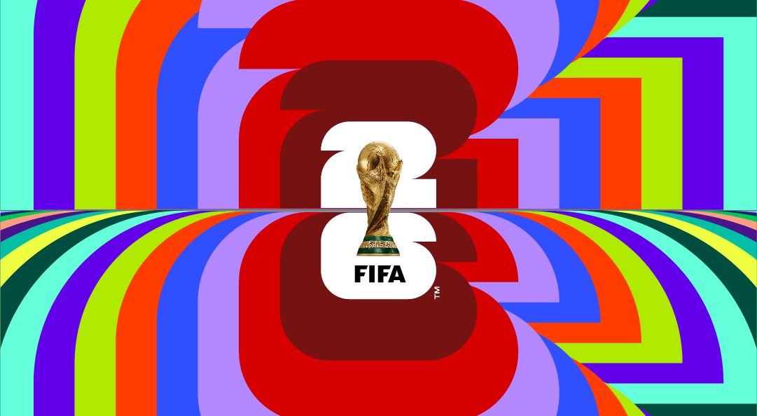
FIFA has unveiled the official logo for the 2026 World Cup which contains, well, a 26 and the World Cup.
Breaking from past tradition of colorful logos that contain plenty of pertinent information, FIFA has gone with an understated look for the tournament in the United States, Mexico and Canada.
Absent from the logo are the name of the tournament, the names of the host countries, and any identifiable characteristics of the host countries. It does, however, have the trophy.
The 2026 logo and brand identity were revealed at an event in Los Angeles on Wednesday night. Simplicity and customization were the operative words for the logo, which each of the 16 host cities will be able to modify with their own colors and wording.
#WeAre26 pic.twitter.com/H1SyqypUYY
— FIFA World Cup (@FIFAWorldCup) May 18, 2023
The “We Are 26” campaign was launched alongside the logo.
“We are 26 is a rallying cry,” said FIFA president Gianni Infantino in a release. “It’s a moment when three countries and an entire continent collectively say: ‘We are united as one to welcome the world and deliver the biggest, best and most inclusive FIFA World Cup ever.’ The tournament will enable each host country and participating team to write their own page in the history books of FIFA World Cups, and this unique brand is a major step on that road to 2026.”
The majority of opinions on the logo seemed to be underwhelmed, though some did appreciate the simplicity and customizable nature. In any case, we at Pro Soccer Wire have designed an alternative that anybody disillusioned by the logo is welcome to use.
We’ve helpfully put that logo at the bottom of these reactions. Please use it at your leisure.
