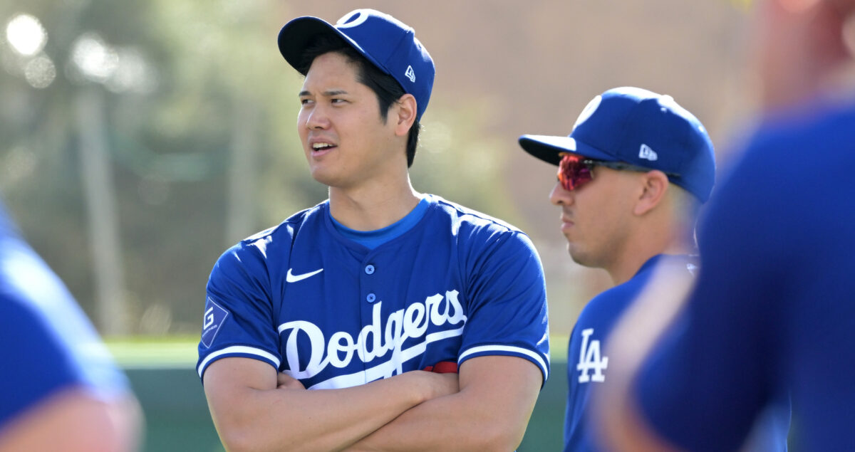
We’re just in the early stages of spring training across Major League Baseball, and uniforms have been all the talk at the camps in Arizona and Florida.
As part of the 10-year uniform agreement between MLB, Nike and Fanatics, a new uniform system and design were introduced for this season (first seen during the All-Star Game). And the early returns have not been positive. Nike designed the uniforms while Fanatics has produced both the on-field and retail versions since 2020.
Players across the league have complained about the cheap appearance and feel of the uniforms. It’s gotten to the point where players have escalated the issue to the MLBPA. Fans have also been critical of the name plates, which now have a pronounced curve with a smaller font. On top of that, the MLB logo has been lowered below the collar, making a crowded appearance.
Last year vs this year’s replica jersey offerings from the fine folks at MLB, Nike & Fanatics. Last year’s being on the left and this year’s on the right.
I have a lot to say, so bear with me here.
Let’s just rip the bandaid off right away with this year’s new jersey offerings pic.twitter.com/3IShhlj0nL
— Bobby Mullins (@TheBobbyMullins) February 11, 2024
But are the actual jerseys really that bad? You be the judge. Here’s a look at what the spring training jerseys look like across MLB as the teams reported to camp.
