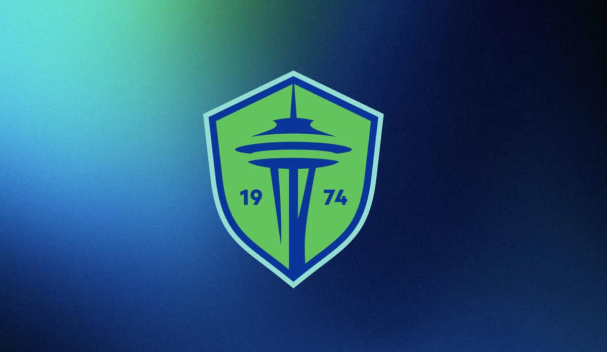
The Seattle Sounders have unveiled a new crest and brand identity ahead of the club’s 50th anniversary in 2024.
The new crest includes a simple representation of the iconic Space Needle as well as 1974, the year the Sounders began play in the North American Soccer League.
The Sounders have been using a logo with the Space Needle and the club’s name since its MLS debut in 2009, and will now receive an updated look starting in the 2024 MLS campaign.
The new brand identity is a result of consultation with fans, former players and alumni, current and former staff, local stakeholders, and members of Seattle’s creative community.
In addition to the new crest, the club will also utilize a wave wordmark that is reminiscent of the club’s original look from 1974.
BREAKING: @SoundersFC unveil their brand evolution with an updated crest, colors, and associated marks following an extended and intentional brand identity review and comprehensive engagement with fans, supporters, community members and other club stakeholders. Here it is! #EBFG pic.twitter.com/cokl3dwTFW
— Jackson Felts 🏆 (@JacksonBFelts) September 26, 2023
The Sounders will also bring back their much-loved orca logo that was utilized during the club’s time in the APSL and A-League. According to the Sounders, fans ranked the orca second behind only the Space Needle when asked what best represented the club.
WAIT THE SEATTLE SOUNDERS HAS AN ORCA FOR A TERTIARY CREST OPTION. ELITE pic.twitter.com/WoSowdALgH
— Tom Bogert (@tombogert) September 26, 2023
[lawrence-related id=25436,28309,29149]
