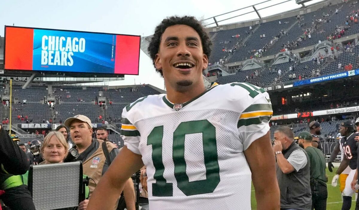
It would be patronizing to open this ranking with a warning about small sample sizes, right? You all know that just because Jimmy Garoppolo was a top five quarterback in Week 1 doesn’t mean he’ll stay that way — or that advanced metrics like completion percentage over expected (CPOE) or expected points added (EPA) aren’t meaningful.
Right, because that’s where we are. 60 minutes of game play per team — though Josh Allen got slightly more — have dropped the first batch of quarterback data into our hands for analysis. And while there are several ways to measure passers, these rankings use advanced stats in hopes of parsing out a player’s overall impact and accounting for the defenses they’ve played. But with limited numbers to draw from, we get some figures that don’t quite pass the smell test.
This is a problem that corrects itself over time as more data points are established and outliers become apparent. But after Week 1 I can tell you, well, no quarterback in the league was more valuable than Jordan Love. Three slots behind him was the man who engineered all of 17 points against the Denver Broncos, Garoppolo.
Phew, OK. Let’s talk about these stats. EPA is a concept that’s been around since 1970. It’s effectively a comparison between what an average quarterback could be expected to do on a certain down and what he actually did — and how it increased his team’s chances of scoring. The model we use comes from The Athletic’s Ben Baldwin and his RBSDM.com website, which is both wildly useful AND includes adjusted EPA, which accounts for defensive strength, considers the impact of penalties and does not negatively impact passers for fumbles after a completion.
The other piece of the puzzle is CPOE, which is pretty much what it sounds like. It’s a comparison of all the completions a quarterback would be expected to make versus the ones he actually did. Like EPA, it can veer into the negatives and higher is better. So if you chart all 32 primary quarterbacks — the ones who played at least 16 snaps in Week 1 — you get a chart that looks like this:

Top right hand corner is good. Bottom left corner is bad. Try splitting those passers into tiers and you get a big ol’ jumble that looks like this:

There are a lot of players taking up the creamy middle ground and some strange outliers. That makes it tough to separate this year’s quarterbacks into tiers at such an early date. Instead, we’ll kick off the season by ranking each QB by adjusted EPA/play alone and wait for CPOE numbers to stabilize a bit. So how do these 32 quarterbacks shake out in an entirely-too-small-to-be-meaningful sample size?
