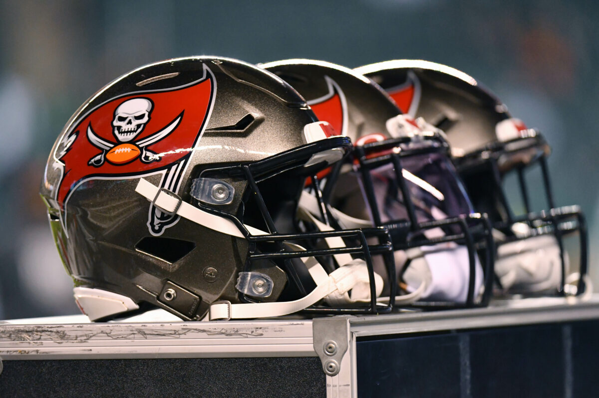
The Tampa Bay Buccaneers made the wise decision in 2020 to admit a terrible aesthetic mistake from 2014, ditching their awful uniform design for a return to their championship roots.
After six years of alarm-clock numbers and other awful fashion decisions, the Bucs went back to the look they wore starting in 1997, with a handful of small adjustments.
But does Tampa Bay’s current helmet logo rank among the league’s best designs?
Not according to our good friends at For The Win, who ranked the Bucs’ helmet No. 26 in the league, out of 32 teams:
Here’s what FTW’s Christian D’Andrea said about Tampa Bay’s dome:
Buccaneer Bruce will likely return this season. He’ll serve as a stark reminder this team should never given up creamsicle orange.
You won’t get any argument from me on the creamsicle love, but Tampa Bay’s current look is one of the best, most iconic getups in the entire NFL. It’s not too busy, but has enough detail to be eye-catching. The colors work well together, and the pewter helmet is a unique color no other team has.
There are plenty of other helmets that deserve to be ranked lower than Tampa Bay’s, creamsicle or otherwise.
[listicle id=68867]
