[anyclip pubname=”2123″ widgetname=”0016M00002U0B1kQAF_M8170″]
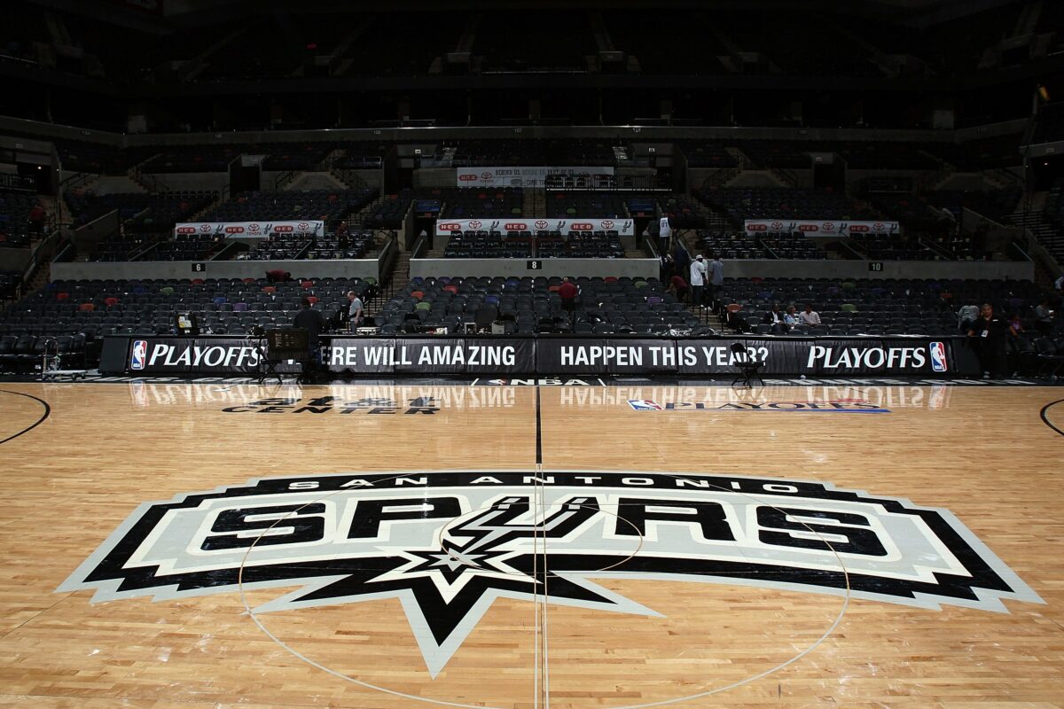
The beloved San Antonio Spurs logo delivers what it promises. There’s a spur and the team’s name right there. What’s not to love? The team even pivoted away from the more colorful version of the logo in 2002, making things even more straightforward. Evidently the mastermind (or minds) behind the social media account NBA Paint decided there was room for improvement, however.
In a video explaining the problems with San Antonio’s current logo, a few aesthetic concerns were raised. First, NBA Paint claimed the normal Spurs logo doesn’t make it clear what sport the team even plays. Perhaps more jarring, the current version of the logo has “0 rootin and tootin energy,” a massive accusation. And one, evidently, that beckoned an equally massive change.
NBA Paint has transformed a number of teams’ logos, and this was San Antonio’s bite at the apple. We won’t spoil the surprise, though. You can check out NBA Paint’s entire transformation of the Spurs logo over on Instagram.
