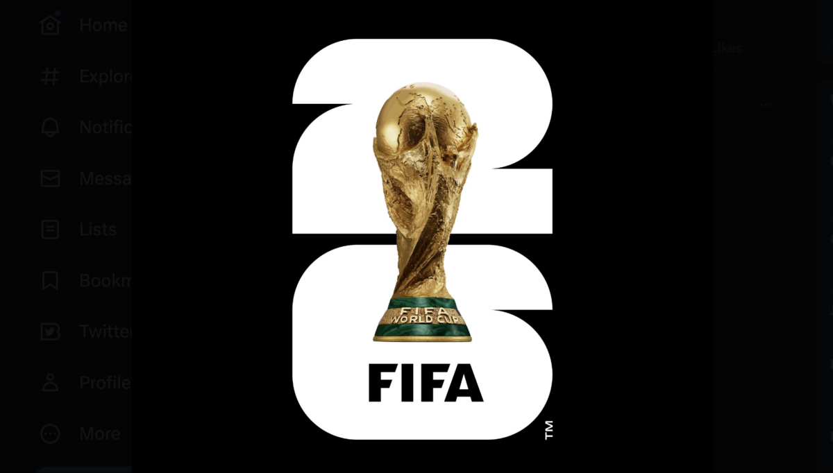
The 2026 FIFA World Cup will mark the first time soccer’s biggest men’s tournament has taken place in the United States (at least partly) since the early 1990s. And judging by the early reveal of the tournament’s logo, FIFA might not be entirely ready for the spectacle of the moment.
On Wednesday night, FIFA unveiled the “We Are 26” logo for the 2026 World Cup, which the U.S., Mexico, and Canada will jointly host. If the intention was to build hype with the logo, the objective clearly failed. If the intention was to create skepticism about FIFA’s direction with the tournament over one mere graphic design snafu, the mission succeeded.
Because it is terrible.
#WeAre26 pic.twitter.com/H1SyqypUYY
— FIFA World Cup (@FIFAWorldCup) May 18, 2023
I mean, seriously: Whose bright idea was it to simply superimpose the World Cup trophy over a generic and white “2” and “6”? There is nothing interesting about this logo. There is nothing that says, “I am now visually stimulated for one of the biggest events in soccer.”
This is the definition of a whiff on a free kick.
[affiliatewidget_deal1]
