[mm-video type=playlist id=01eqbydbzmnr1bhxef player_id=none image=https://steelerswire.usatoday.com/wp-content/plugins/mm-video/images/playlist-icon.png]
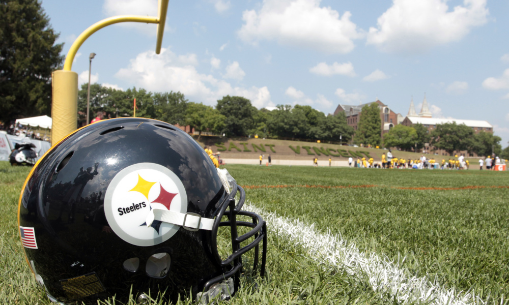
The folks over at For The Win ranked every NFL team’s helmet logo and told Pittsburgh Steelers fans something they already knew. No team has a more distinct and iconic helmet logo than the Steelers. You can check out the full rankings here but here is what they had to say about Pittsburgh.
They took the logo of the industry that built their city and flipped the association from steel mills to Terry Bradshaw. The day they change it is the day Pittsburgh burns to the ground.
While other teams are constantly doing makeovers and redesigns, the Steelers stay the course. Just like on the field, the Steelers have remained consistent with the look of the logo as well as the uniforms. The Steelers have only made minor tweaks to the entire uniform design over the decades and this is just how the fans like it.
In case you don’t know where the logo came from, it was originally the logo for the American Iron and Steel Institute. It features a circle around three four-pointed geometric shapes. These are called hypocycloids and they are yellow, red and blue. Those colors represent the three materials used to make steel: yellow for coal, red for iron ore and blue for steel scrap.
[vertical-gallery id=518635]
[listicle id=519052]
